
Creating a Custom UITableViewCell in Swift 2.0
Transcript – Creating a Custom UITableViewCell in Swift 2.0
In this video we are going to create a Custom UITableViewCell in Swift for our table view in our iOS app.
Creating a Custom UITableViewCell in Swift
This video builds on the last Swift video, UITableView tutorial using Swift 2.0. In the last video we created a tableview app that displayed several items that made us happy in a list. That’s the code we’re going to start with. That code created a table view that lists happy things using the default cell style. This is really cool, but we can do much better. From a visual perspective, our app is kinda boring.
The first change we could make is to add an image to each cell. This is very simple. Every cell has an image property which we can add a UIImage. We can define the image in two ways. In interface builder, we can select an image for our cells. That’s easy, but we’re more likely to assign it in code.
Using the code from the last tutorial, we can add a line to cellForRowAtIndexPath to add an image to every cell. Both methods add the same image to every cell. A little more interesting than our original tableview, but one image is boring.
func tableView(tableView: UITableView, cellForRowAtIndexPath indexPath: NSIndexPath) -> UITableViewCell {

    let cell = tableView.dequeueReusableCellWithIdentifier(cellIdentifier, forIndexPath: indexPath) as UITableViewCell

    // Fetch Happy Item
    let item = happyThings[indexPath.row]

    // Configure Cell
    cell.textLabel?.text = (item as! String)
    cell.imageView?.image = UIImage(named:"heart")
    return cell
}
Let’s pretend our Happy Things app has different categories for happy things. We’ll use an image for persons, places, and things. I added several image assets to the project so we can just refer to them by name.
To use different images, we need to create a class representing a happy thing. This will contain the type of happy thing as an enumeration, and the thing that makes us happy. We’ll also add the date it made us happy, a rating on how happy it made us. We’ll use these later.
class HappyThing : NSObject {
    var name : String
    var date : NSDate
    var rating: HappyRating?
    var happyType :HappyType

    init(name: String!, date: NSDate!, happyType: HappyType!) {
        self.date = date
        self.name = name
        self.happyType = happyType
    }

    init(name: String!, date: NSDate!, happyType: HappyType!, rating: HappyRating!) {
        self.date = date
        self.name = name
        self.happyType = happyType
        self.rating = rating
    }

    override var description: String {
        return name
    }
}
We’ll also change the array definition in our ViewController class like this. We’ll create the instances here.
Now if we go back to cellForRowAtIndexPath, we can use the property from our class to select which image to display. We have three images, but we can expand this idea to any number of images. If every happy thing had it’s own image, we’d likely store the image in the class. The process is the same.
In the last tutorial we selected a cell style of basic, but we didn’t talk about what that meant. Every UITableViewCell in our tableview has a cell style. There are four different cell styles – basic, right detail, left detail, and custom. We can define the cell style for a cell in interface builder by going into the attributes inspector and selecting the cell style we want.
Basic UITableViewCell style
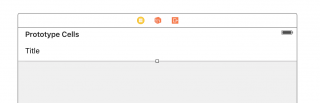
Basic UITableViewCell style
The basic cell style is the style we have used up to this point. It contains a text field and an optional image. There’s not too much to it. That’s why it’s called basic.
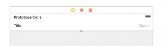
Right Detail UITableViewCell style
Subtitle UITableViewCell style
Right detail cells look like this. They have the same text field as the basic cell style, but they also contain a detail string to the right. So we could display our happy thing, and the date added to the right. Adding an image to it looks like this.
Left Detail UITableViewCell style
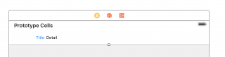
Left Detail UITableViewCell style
Left detail cells are not that surprising. They start with our string in blue, and then the detail string is to the right in black. Using our data, the cells would look like this.
Subtitle UITableViewCell style
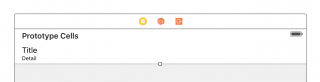
Subtitle UITableViewCell style
Subtitle cells move the detail string below the text like this. With the happy things data, our table would look like this. It’s all interesting, but we really want to do something more custom.
Custom UITableViewCell style
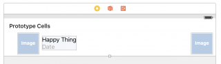
Custom UITableViewCell style
What we want to display is something like this. We want the happy thing above, the date below, and a rating of how happy this makes us to the right. We’ll use hearts to display our rating. Hearts are a shape my paint program draws by default.
The first thing we need to do is change the cell style to custom. This will allow us to create any cell style we want. And by anything, I mean we can create any view that fits into a table view cell and display it. Every UITableViewCell inherits from UIView.
That gives us a blank view. There’s nothing there, but we can add anything we want. For this tutorial, we’ll add two UIImageView controls and two UILabel controls (see custom example). We’ll position one image to the left and one to the right. We’ll also make sure the reuse identifier is “cell”. It should still be set from the last tutorial, but it’s good to check. It’s something easy to forget.
Next we need to create a swift class file to represent this cell. We’ll create a IBOutlet for every control we added to the view. So that’s the left and right image, the happy text, and the date text.
class MyTableViewCell: UITableViewCell {
    @IBOutlet var leftImage: UIImageView?
    @IBOutlet var rightImage: UIImageView?
    @IBOutlet var happyName: UILabel?
    @IBOutlet var happyDate: UILabel?
}
Once we save the file, we need to make sure our cell custom class is set to the class we just created. It’s in the Identity Inspector.
Next we’ll hook these back to our cell. We just control drag to hook up our IBOutlets to the correct control. We’ll hook up all four controls. Nothing crazy there.
If you remember in the previous lesson, we set the label in our datasource. We’re going to set the fields in our custom cell in the same place. The first thing we’ll change is the class we’re dequeueing to our custom class.
Our cell no longer has the text and detail attributes from the built in cell types. We need to use the controls we created. So we’ll set the labels like this.
class MyTableViewDataSource: NSObject, UITableViewDataSource {

    var happyThings: [HappyThing]
    var cellIdentifier: String
    let header = "Happy Things"
    let dateFormatter = NSDateFormatter()

    init(happyThings: [HappyThing]!, cellIdentifier: String!) {
        self.happyThings = happyThings
        self.cellIdentifier = cellIdentifier
        dateFormatter.dateStyle = NSDateFormatterStyle.MediumStyle
    }

    func tableView(tableView: UITableView, numberOfRowsInSection section: Int) -> Int {
        return happyThings.count
    }

    func tableView(tableView: UITableView, cellForRowAtIndexPath indexPath: NSIndexPath) -> UITableViewCell {

        let cell = tableView.dequeueReusableCellWithIdentifier(cellIdentifier, forIndexPath: indexPath) as! MyTableViewCell

        // Fetch Happy Item
        let item = happyThings[indexPath.row]

        // Configure Cell
        cell.happyDate?.text = dateFormatter.stringFromDate(item.date)
        cell.happyName?.text = (item.description)

        // set person, place or thing image
        switch item.happyType {
            case HappyType.Person:
                cell.leftImage?.image = UIImage(named:"image_person")
            case HappyType.Place:
                cell.leftImage?.image = UIImage(named:"image_place")
            case HappyType.Thing:
                cell.leftImage?.image = UIImage(named:"image_thing")
        }

        // Display rating image
        switch item.rating! {
            case HappyRating.OneHeart:
                cell.rightImage?.image = UIImage(named:"1_hearts")
            case HappyRating.TwoHearts:
                cell.rightImage?.image = UIImage(named:"2_hearts")
            case HappyRating.ThreeHearts:
                cell.rightImage?.image = UIImage(named:"3_hearts")
            case HappyRating.FourHearts:
                cell.rightImage?.image = UIImage(named:"4_hearts")
            case HappyRating.FiveHearts:
                cell.rightImage?.image = UIImage(named:"5_hearts")
        }

        return cell
    }

    func tableView(tableView: UITableView, titleForHeaderInSection section: Int) -> String? {
        return header
    }

}
The images will get added in a simple case statement. That’s because we only have a few images. If we wanted to have a picture of every happy thing, we might store the image link in the happy thing class.
Finally we’ll run the app, and we’ll get what we hoped for. Maybe we should add “A working app” as one of our happy things. You can add that as an exercise at home.
OK, again the source code is available on GitHub. If you have any questions, let me know. There is a warning indicating some layout issues. It doesn’t seem to adversely affect the app. If you know what to fix, let me know in the comments or submit a pull request.
If you have any questions let me know in the comments. New videos are out every week, so make sure you subscribe. This puts new videos in your YouTube feed. I also have an newsletter on DeegeU.com. I’ll send this out once every month with links to the month’s videos and any other tips and tricks not on YouTube. The newsletter list is not shared or sold, so you’ll only get an email once a month from me.
And with that, I’ll see you in the next tutorial!
<!-- DeegeU - Right Side -->
<ins class="adsbygoogle" style="display:inline-block;width:336px;height:280px" data-ad-client="ca-pub-5305511207032009" data-ad-slot="5596823779"></ins>
<script>
(adsbygoogle = window.adsbygoogle || []).push({});
</script></p>
Tools Used
- Swift 2.3
- Xcode Version 7.3 (7D175)
- iOS 9.3.1 (13E238)
Media Credits
All media created and owned by DJ Spiess unless listed below.
- Colored Tomatoes used under Creative Commons CC0 via PixaBay
- No infringement intended
EDM Detection Mode by Kevin MacLeod is licensed under a Creative Commons Attribution license (https://creativecommons.org/licenses/by/4.0/)
Source: http://incompetech.com/music/royalty-free/index.html?isrc=USUAN1500026
Artist: http://incompetech.com/
Get the code
The source code for “Creating a Custom UITableViewCell in Swift 2.0” can be found on Github. If you have Git installed on your system, you can clone the repository by issuing the following command:
git clone https://github.com/deege/deegeu-ios-swift-tableview-custom-cells.git
Go to the Support > Getting the Code page for more help.
If you find any errors in the code, feel free to let me know or issue a pull request in Git.
Comments

DJ Spiess
Your personal instructor
My name is DJ Spiess and I'm a developer with a Masters degree in Computer Science working in Colorado, USA. I primarily work with Java server applications. I started programming as a kid in the 1980s, and I've programmed professionally since 1996. My main focus are REST APIs, large-scale data, and mobile development. The last six years I've worked on large National Science Foundation projects. You can read more about my development experience on my LinkedIn account.